
Dot Hutchison’s thriller novel of the same name “tells the story of a beautiful and deadly garden, where young women are kept captive and tattooed with butterfly wings”
And the man who holds them, the gardener, has a twisted obsession with preserving the beauty of his beloved butterflies.
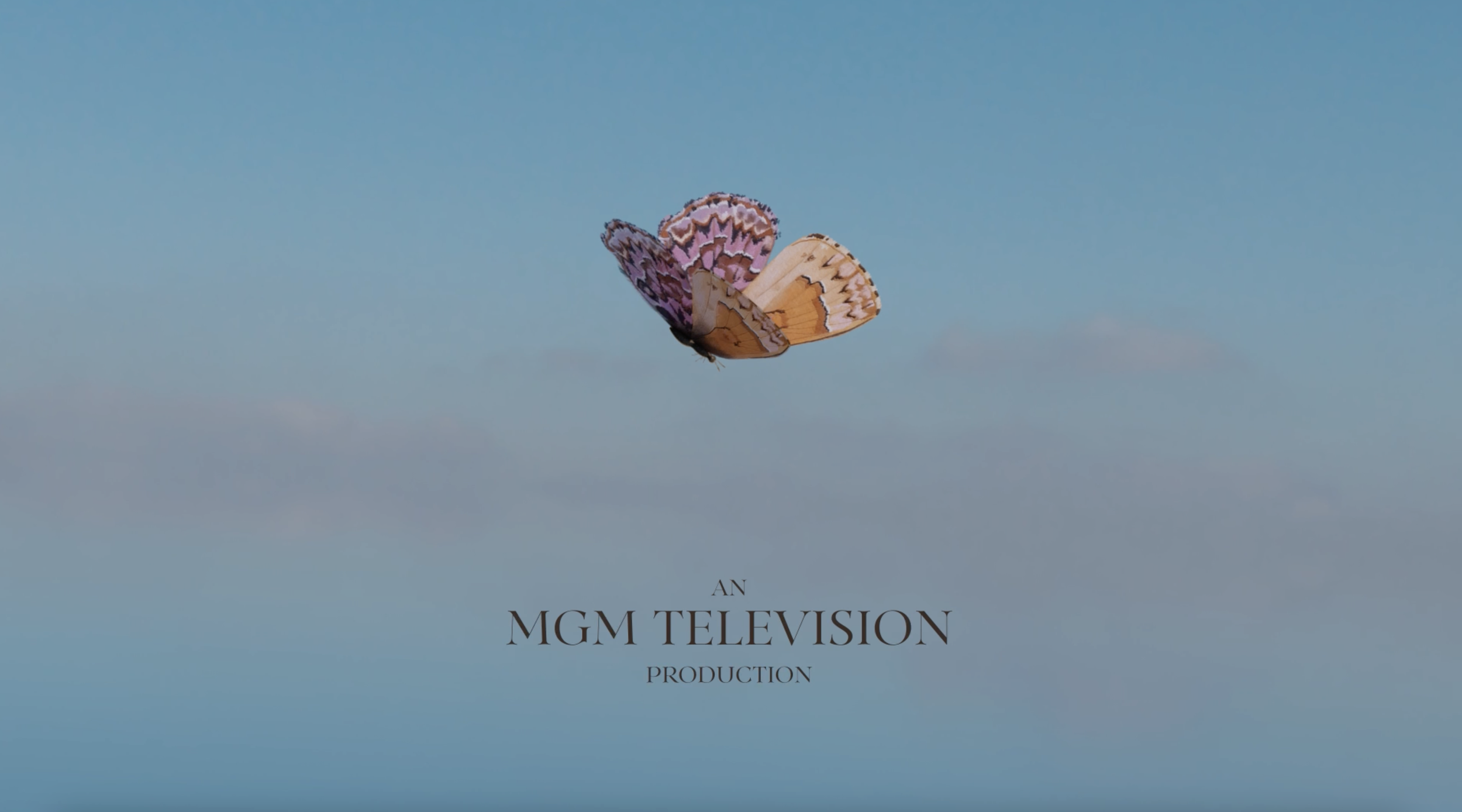
This title sequence explores the process of preserving a butterfly to both mimic the gardener's twisted obsession with preservation as well as exploring the themes of confinement and loneliness present in Dot Hutchison's novel. The butterfly's are rendered in a very organic, hand drawn style to juxtapose the very meticulous, sterile environment the gardener puts them in.
Art Director: Sophia D'Alleva
Designer and Animator: Sophia D'Alleva
Music: "Waiting and Hoping" Lance Conrad
Process
Storyboard

My storyboard was created with several main beats of the story in mind before I decided on sound. I wanted the butterfly to start out alive and free before abruptly moving into the still, dead world as it goes through the preservation process. The western pine elfin is the main character of this sequence but I wanted to very quickly introduce other butterflies to signify this story follows multiple characters. In the book, our main character Inara has a history of being neglected by the world but inside the butterfly garden she finds support and a shining light of hope through the other girls being held there. I wanted the progression of this storyboard to show how even in the loneliest, most isolated moments, you are never truly alone.
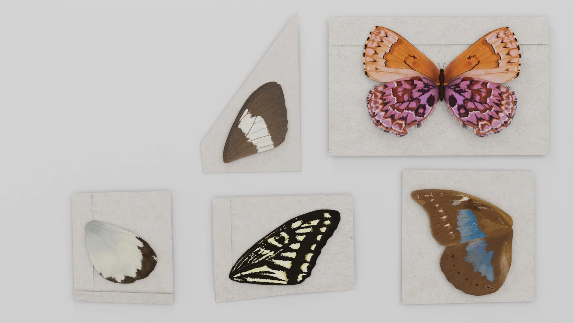
Styleboards

This style board was used to gather inspiration for both the butterflies themselves as well as their environment.
The environment is meant to symbolize "The Gardener" who is often described in the book as extremely meticulous and the butterfly wings he tattooed as horrifyingly beautiful. I wanted his world to be visualized as sterile and uncomfortably clean.
The butterfly wings are to symbolize the characters in the book. They are bright colors with natural textures which creates visual contrast as well as juxtaposition with their environment. I went for a hand drawn style to visualize the character's persisting humanity that The Gardener attempt to strip away.
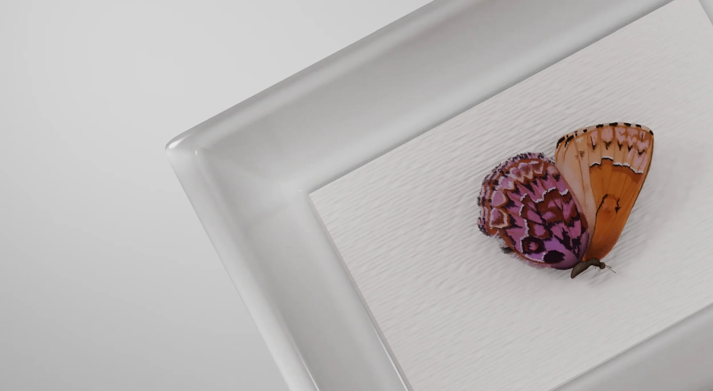
Initial Style Frames

When creating my style frames my main goal was to build a very cohesive environment and provide a lot of contrast between the butterflies and their environment. To do this, I illustrated the wings in procreate utilizing watercolor brushes and textures and then set them in a very clean, sterile environment which I built in Cinema4D.
There were three main pieces of feedback I received on my initial style frames that I revised and implemented into the final piece.
1.) The 'dead/sterile' world was too flat. To remedy this, I adjusted my simple 3 point lighting setup to include and overhead gobo light. This allowed me to bring more depth into the flat shots as well as use the light to highlight the main butterfly in each scene.
2.) The butterfly body stood out too much against the wings and drew too much focus. I adjusted the illustration of the wings so that the brown of the body created a gradient with the wings themselves and helped the butterfly look more unified.
3.) The black text was way too dark. Since I didn't have a true black anywhere else it made more sense to opt for a dark brown which is used in multiple butterfly wings throughout the piece.
Final Style Frames


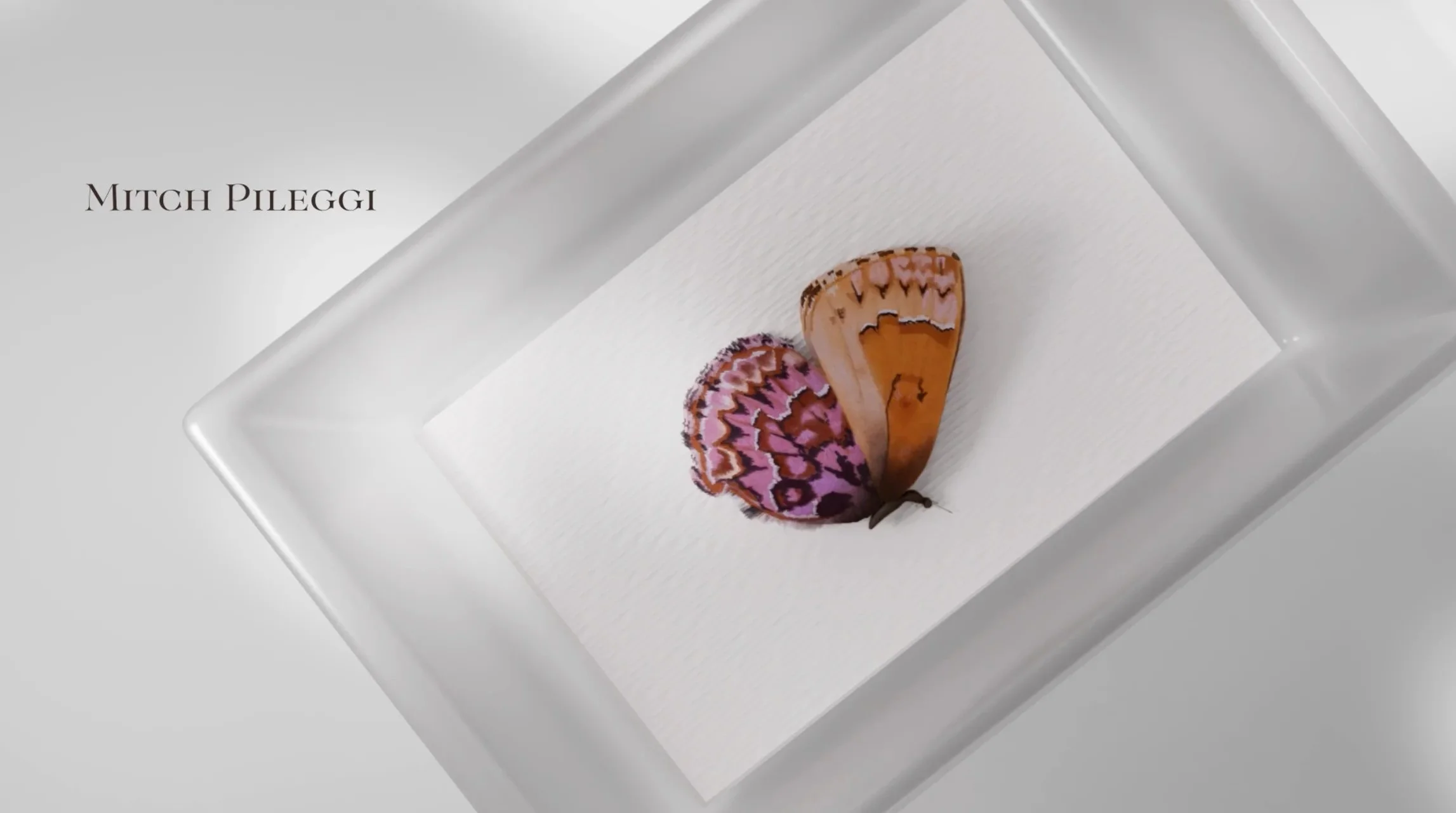

In the finalized versions you can see a more strategic use of lighting to create depth and emphasis, a much more cohesive butterfly where the wings and body meld together and type that adds to the composition instead of distracting from it.